ESSENCE OF COLOUR
- Rashika Lungani

- Aug 12, 2020
- 5 min read
Updated: Mar 24, 2021
DAY 1& 2
Today's activity encouraged me to use my vision and sense of colour to recreate the articles of beauty that exists around us, yet often go unseen. Doing this project made me realise that there is a huge difference between the colour that is believed to be the colour of a particular object and the actual colour. Tones and undertones together play a beautiful roll in adding life to the object.
DAY 3
MIND MAP


DAY 4
MOVIE ANALYSIS


REFLECTION 1
As a lover of both history and art, I would like to quote Akbar’s court historian Abu’l Fazl who described painting as a “magical art”: in his view colour has the power to make inanimate objects look as if they possessed life. This project helped me realise the power of colour. I always knew colour had the power to influence minds. My unconscious mind was well aware of the fact that blue makes me happy and brown makes me disgusted. However, after doing this project and understanding the context behind colours enabled me to realise these things with my conscious mind as well. Recreating the colour swatches of everyday items made me understand the depth and layers to simple shades. It made me appreciate the purple hue behind an apple and the orange hue of a ketchup.
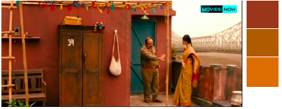
Hues, shades and tints, though usually overseen as just aspects of colour can greatly influence the way we perceive them. While light blue is usually seen as a symbol of peace, its shade, a darker blue is usually seen as a representation of storm. This project helped me exercise my senses, and heighten them. It allowed me to expand my knowledge of colour and understand there association with feelings and emotions. Watching the video by vanity fair about the use of colours in movie, sensitised me towards the use of colour to create depth, setting the mood, influencing the emotions and so much more. The video reminded me of my favourites scenes from barfi, the use a subtle colours to show the simplistic love of two differently abled people with minimum use of words makes a huge impact on the mind of the viewers. There are many monochromatic scenes in the movie, It indicates that the leads are ordinary. A beautiful way to depict indifference.
No one reacts to colour the same way. Everyone has a different way of understanding colour. Through the help of the reading I was able recognise the use of colour in branding, it’s influence on the buyers, as well as means to attract the target audience and how the hues, shades, tints, all influence emotions, and can be used to make profitable business gains. During the group discussion almost everyone agreed that brown colour would not be attractive as a logo. They also confirmed that bright and simple logos appear more attractive to them as a consumer. I think I can come out of this exercise with an improved understanding of colour and it’s association with various aspect of life.

REFLECTION 1(REVISED)
As a lover of both history and art, I would like to quote Akbar’s court historian Abu’l Fazl who described painting as a “magical art”: in his view colour has the power to make inanimate objects look as if they possessed life. This project helped me realise the power of colour. I always knew colour had the power to influence minds. My unconscious mind was well aware of the fact that blue makes me happy and brown makes me disgusted. However, after doing this project and understanding the context behind colours enabled me to realise these things with my conscious mind as well. Recreating the colour swatches of everyday items made me understand the depth and layers to simple shades. It made me appreciate the purple hue behind an apple and the orange hue of a ketchup.
Hues, shades and tints, though usually overseen as just aspects of colour can greatly influence the way we perceive them. While light blue is usually seen as a symbol of peace, its shade, a darker blue is usually seen as a representation of storm. The warmth or coldness behind a colour influences its perception by the views. While more Blueish purple might remind people of lavender, the same purple with hints of red reminds them of celebration. A bright green indicated freshness but when its intensity is reduced, its associated with something gross.
I was able to expand my knowledge of colour and understand there association with feelings and emotions. Watching the video by vanity fair about the use of colours in movie sensitised me towards the use of colour to create depth, setting the mood, influencing the emotions and so much more. The video reminded me of my favourites scenes from Barfi, the use a subtle colours to show the simplistic love of two differently abled people with minimum use of words makes a huge impact on the mind of the viewers. There are many monochromatic scenes in the movie which indicates that the leads are ordinary. A beautiful way to depict indifference.
No one reacts to colour the same way. Everyone has a different way of understanding colour. Through the help of the reading I was able recognise the use of colour in branding, it’s influence on the buyers, as well as means to attract the target audience and how the hues, shades, tints, warmth. intensity can all be used to make profitable business gains. During the group discussion almost everyone agreed that brown colour would not be attractive as a logo. They also confirmed that bright and simple logos appear more attractive to them as a consumer.
I think I can come out of this exercise with an improved understanding of colour and it’s association with various aspect of life.

DAY 5
PAINTING ON DIFFERENT MATERIALS


SURVEY


REFLECTION 2
Colour has the power to convey messages in a way words can not. This project peaked my curiosity and encouraged me to dive deeper into the associations of colour. I know that in hindu marriages red colour is used to symbolise the planet mars, the same red is used to symbolise the Holly berries, which is said to represent the blood of Jesus when he died on the cross. Colour also plays a very important role in marketing and in touching the unconscious mind of the consumer. I learned about how different colour can succeed or fail in different region, how just changing the packaging can lead a brand to success. Watching the video by vanity fair about the use of colours in movie, sensitised me towards the use of colour to create depth, setting the mood, influencing the emotions and so much more. The exploration into the use of different materials allowed me to assess the property of colour of different surface finishes. I realised how blue and green, being complimentary to red, bring our it’s brightness. While yellow makes red appear dull. During the group discussion on associated noticed that there was a conflict of opinion between the people who associated red we either femininity or masculinity. Keeping this in mind I asked the participants regarding the gendered associated to the colour red. I noticed that when asked to chose the shade that attracts them the most, the people choose the brightest colour, which has the longest wavelength. By associating wine with luxury I was able to find out that people associate darker shades of red with prosperity.
FINAL FEEDBACK


Comments